Creating a peaceful and relaxing environment at home often starts with the colors you choose. Calm colors have the power to soothe the mind, reduce stress, and make your living space feel welcoming. Whether you are painting walls, choosing furniture, or adding accents, selecting the right calm colors can transform your home into a place of comfort.
In this post, we’ll explore practical tips for choosing calm colors that fit your style and create a tranquil atmosphere.
Why Choose Calm Colors for Your Home?
Colors affect our mood and emotions in powerful ways. Bright, bold colors can energize but sometimes overwhelm, while calm, muted tones help foster relaxation. When your home feels peaceful, it’s easier to unwind after a busy day or enjoy quality time with family.
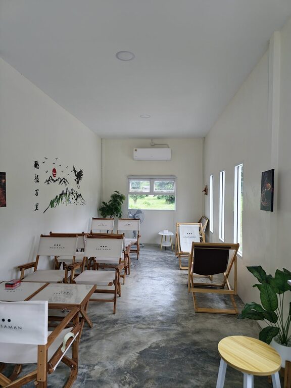
Calm colors often include soft blues, gentle greens, light grays, creamy whites, and warm beiges. These shades mimic nature’s peaceful settings like the sky, ocean, or a quiet forest.
—
Start with a Color Palette That Soothes
Before you pick specific colors, think about the overall palette you want in your home. A well-balanced palette mixes calm colors harmoniously without clashing or feeling dull.
Tips for Creating Your Palette:
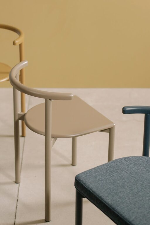
– Limit Your Colors: Choose 2-4 main colors to keep the look cohesive and uncluttered.
– Use Neutrals as a Base: Neutrals like soft gray, beige, or white offer a calm foundation.
– Add Color Accents: Soft blues or greens work as accent colors to bring subtle life.
– Consider Undertones: Even calm colors can have warm or cool undertones—choose ones that match your home’s lighting and furniture.
—
Pick Colors Room by Room
Each room serves a different purpose, so consider how you want to feel in each space.
Living Room
This is a social area where comfort matters. Soft grays or muted greens create a restful backdrop that invites relaxation.
Bedroom
Ideal colors for rest include pale blues, lavender, or gentle sage green. These shades encourage calmness and help improve sleep.
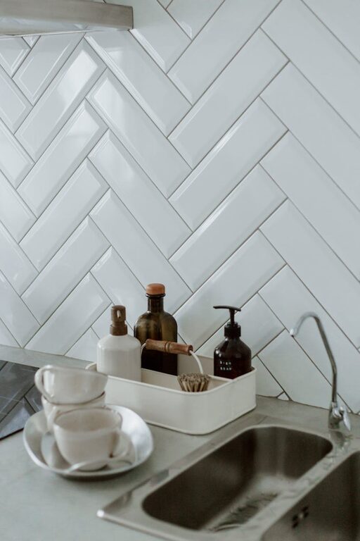
Kitchen
Light neutrals with warm undertones, such as creamy whites or soft taupes, create warmth without overstimulation.
Bathroom
Spa-like colors like seafoam green, soft aqua, or light gray help evoke cleanliness and tranquility.
—
Test Colors in Different Lighting
Light changes how colors look. Natural light makes some hues appear brighter, while artificial light can add warmth or coolness.
How to Test:
– Apply sample paint swatches to your walls.
– Observe the color at different times of day—morning, afternoon, evening.
– Notice how the color looks with your existing furniture and flooring.
—
Use Texture and Finishes to Enhance Calmness
Beyond color, texture influences how a room feels.
– Matte or Satin Finishes: These soft finishes prevent glare and contribute to a calm atmosphere.
– Natural Materials: Wood, linen, and cotton add warmth and comfort.
– Layer Textures: Use cushions, rugs, and throws in calm colors to add depth without loud patterns.
—
Avoid Overwhelming Patterns and Bright Accents
While calm colors focus on serenity, small, intentional pops of color or subtle patterns can add interest without chaos.
Recommendations:
– Choose soft, simple patterns like subtle stripes or gentle florals.
– Use bright colors sparingly as accent pieces—think a pillow or vase, not entire walls.
—
Bring Nature Indoors
Natural elements remind us of peaceful outdoor spaces and pair beautifully with calm colors.
– Add plants to your rooms; the green complements most calm palettes.
– Use artwork that reflects natural themes like landscapes or botanical prints.
—
Final Thoughts
Choosing calm colors for your home is a rewarding way to create a restful, inviting environment. Take your time to select hues that resonate with you, test them in your space, and combine them with natural textures. The result will be a balanced home where you feel relaxed and at ease.
Remember that calmness comes not just from color but from thoughtful decoration and a cozy atmosphere.
Do you have a favorite calm color? Share your experience in the comments below!